This is a Quartz installation, which I am currently styling like my local Obsidian.
This Stylesheet is used to explore css-stylings for different markdown features, while also demonstrating ideas for people in search of inspiration on how to customizing their own secondBrain.
This page also serves as my project-notes for further theme developement.
I am not quite happy with it yet to be honest. The design is still all over the place. I am publishing it tho, in hopes others might have useful input for me as well.
I’d love to hear from you. Feel free to contact me, if you got any feedback or just wanna have a nerdy conversation about design psychology / philosophy.

THE PINK QUANTA COLOR THEME
The goal of the Pink Quanta design is to empazise central information, so that you can grasp the content fast and are able to decide if it is worth your time.
How do we know something is important? Through contrast.
Our brain is programmed to focus on stimuli that stand out. A page consists of many information chunks (QUANTA), therefore a clean but also distinguishable layout is important to me.
The styling of my System/theme follows one simple rule:
Blue is used for Links and references (WHERE & WHAT), PINK is the indicator (HOW/WHY).
This theme is designed to be used primarily in darkmode, to fully emerse with the content. (Use the “sunny” icon near the search function)
Here is some dummy content
Lorem Ipsum is simply dummy text of the printing and typesetting industry. Lorem Ipsum has been the industry’s standard dummy text ever since the 1500s, when an unknown printer took a galley of type and scrambled it to make a type specimen book. It has survived not only five centuries, but also the leap into electronic typesetting.
Block-Quotes
Its important to me, that external sources / quotes are well recognized as such. Therefore the sorta-APA-styling.
– Author title
Lorem Ipsum is simply dummy text of the printing and typesetting industry. Lorem Ipsum has been the industry’s standard dummy text ever since the 1500s, when an unknown printer took a galley of type and scrambled it to make a type specimen book. It has survived not only five centuries, but also the leap into electronic typesetting.
At the start of a note I often describe the purpose, overview & status quo of the note / topic, as well as some todos
- general info
- Mostly just some sorted lists
- Sublists are great to build a quick structure!
- Mostly just some sorted lists
- Quicklinks
- people
- related Projects
Todos
-
#toExample Task 📅 2024-04-11 ✅ 2024-04-10- Another sub-todo
- Unchecked Task
I also use Dataview to display a table of contents if the note happens to be a MOC.
How I use headings and style my notes
I have changed how headings are displayed significantly, to make them more distinct.
Overview of the heading stylings
I dont really use Heading 1 at the top of a note, since the filename already introduces the topic.
I use the plugin Linter to automatically add the filename as a title to my metadata, which is more elegant than double the filename as the first heading.H1: that enables me to repurpose the H1. It really pops out and has a big devider on top, and is used to separate the MAIN Topics within a large Note
Heading 2: Is used as my “H1”
Heading 3: is bold & pink (or underlined in pink)
Heading 4: is italic & underlined in pink
Heading 5: USED FOR DEFINITIONS or single atomic pieces of text within a large paper
Heading 6: is monospace. Good for listing the small examples (atomic level) that can easily be linked/embedded elswere.
LIST of issues
TODO
- Convert my Obsidian-CSS to SCSS for quartz
- Heading stylings
- Colors
- Change how embeds are displayed
- MOC pages
- hide inexisting links
- configure RSS
- Exclude tag from this.tag.pagelist
- Different body-fonts for light/DarkMode
- Custom fonts besides google.fonts (i wanna have this baby beautiful and fully open source)
- Learn how to build a hook
- Add a SiteLogo, which is only displayed on Desktop (left sidebar) but is hidden on mobile
Component.DesktopOnly(Component.SiteLogo()),is not working properly, also displayes it on mobile
Darkmode issues
- Different siteLogo for light/DarkMode
- Make the darkmode the default option for new users visiting the page
SiteLogo: Different versions for light/darkmode
To versions of a siteLogo, one for light, one for darkmode. Change the siteLogo when themechange event occours.


You can also listen to the
themechangeevent to perform any custom logic when the theme changes.
Thats written in the Quartz Documentation , yet I dont know how to approach this
document.addEventListener("themechange", (e) => {
  console.log("Theme changed to " + e.detail.theme) // either "light" or "dark"
  // your logic here
})
Advanced Things to solve for later
- Create MOC-Layout w/ short summaries of the pages, sort/query via metadata
- I really love how David Buchan solved this one in his Quantum Garden
- still need a good method to distinguish articles in English & German
Different styled items
Lists <li>
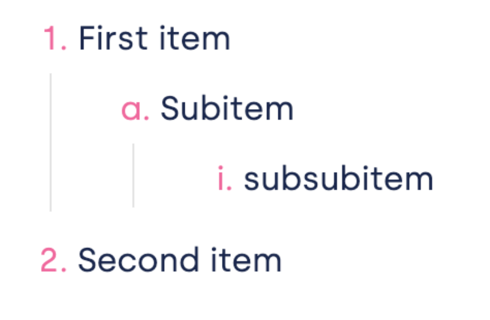
Ordered Lists <ol>
- First item
- Subitem
- subsubitem
- Subitem
- Second item
I havent managed to change the list behavior to my obsidian css, which uses alpabetical and roman lists for the subcathegories

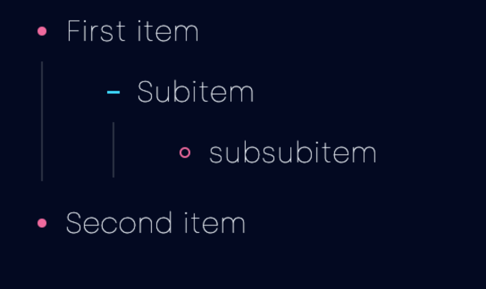
Unordered bullet lists <Ul>
- First item
- Subitem
- subsubitem
- Subitem
- Second item
Same with the unordered bullet lists

Embeds
testsheet
h1 Title
Title H2
Title H3
Title H4
Image with transparent Background?
Link to original
Things I changed in Quartz 4 instance
- Had a Weird behaviour on desktop (both on my 14” mac and 24” screen, all browsers): when the page is displayed at 100% the “mobile version” is shown, with a Header & Footer and no sidebars. Only if I zoom out to 90%, both sidebars get visible. I want to have this as a default, that desktop always gets a desktop view.
- Solved it for now by changing $sidePanelWidth to 360px in
variables.scss
- Solved it for now by changing $sidePanelWidth to 360px in

